PATH@PENN
Simplifying the Course Registration Process
Role
Full-Stack Designer
Timeline
2023 (5 weeks)
Skills
Product Design
User Research
Prototyping
Drag to see before & after!
01 Overview
The Problem
Path@Penn is a student portal at the University of Pennsylvania. The University Registrar has noticed an increase in help desk requests resulting from students’ inability to find information and complete tasks related to course registration.
Project Goals
Redesign the landing page and the course registration process of Path@Penn to better meet user needs, increase usability, and decrease help desk requests.
02 Research
Usability Audit
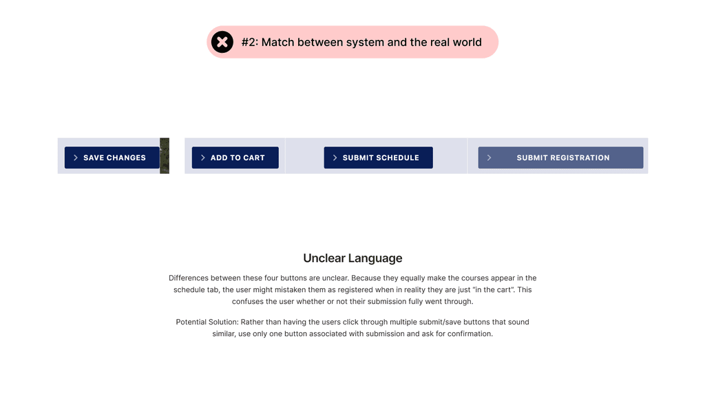
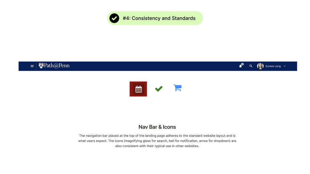
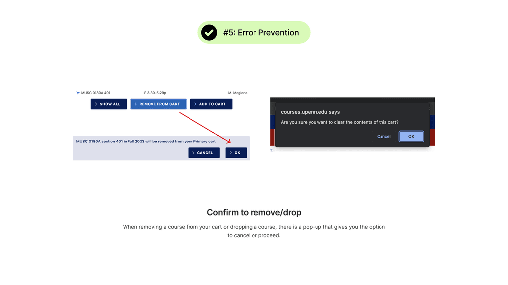
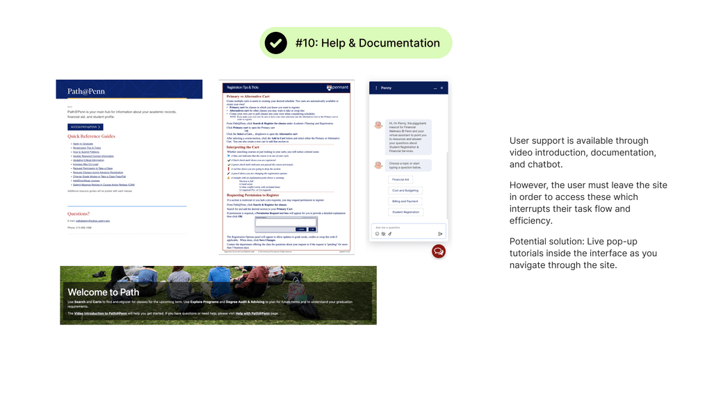
I began my research process by conducting a usability audit referencing the 10 Usability Heuristics for User Interface Design. This exercise helped me identify key usability issues and inform my design decisions.


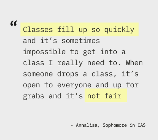
User Interviews
I conducted user interviews with 4 current Penn students with varying levels of experience with Path@Penn to further identify pain points


Interview Notes / Affinity Mapping
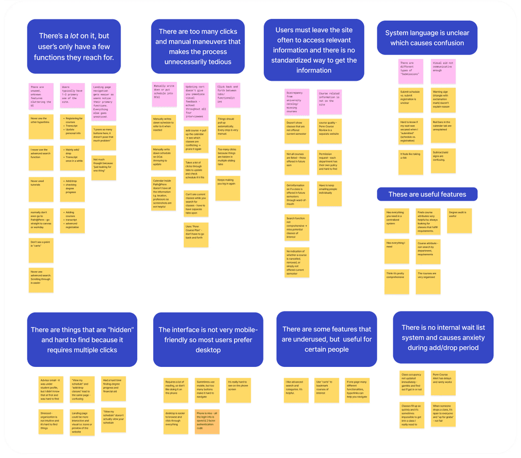
Themes
After synthesizing insights from user interviews and the usability audit, I identified these recurring themes
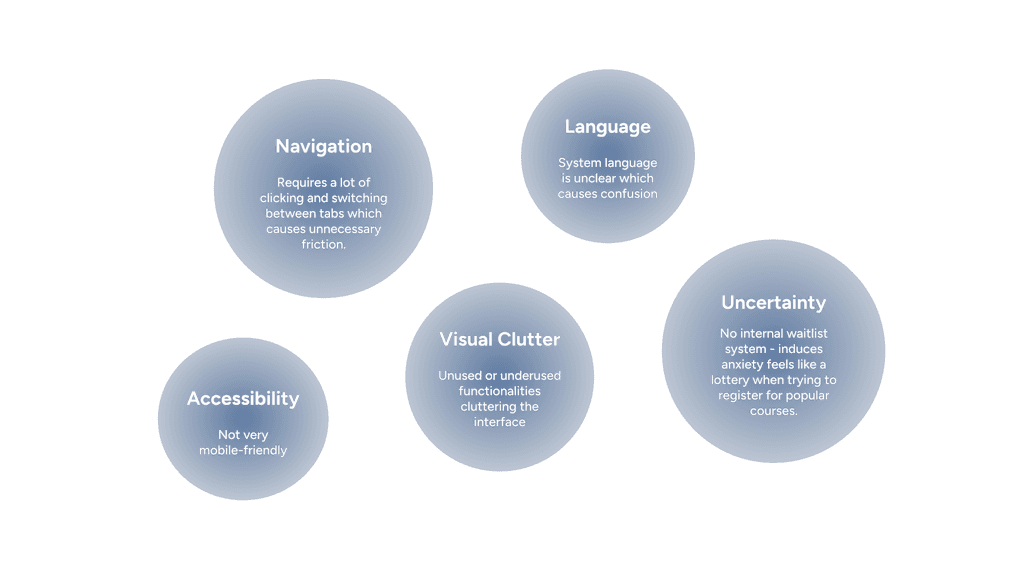
Opportunities
With these insights, I focused on the following questions
03 Brainstorming Solutions

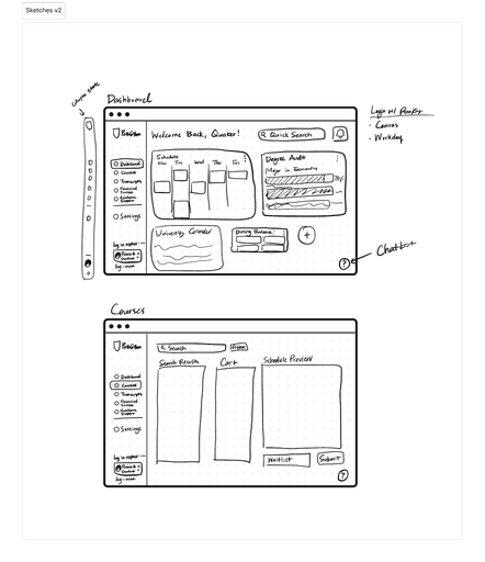
Iteration #1
Adding visual aid with icons
Users reported the icons made the landing page less overwhelming and easy to navigate.
However, it still did not solve the problem of constantly switching between tabs.

Iteration #2
At-a-glance dashboard design
I chose to explore a dashboard design featuring customizable widgets, allowing users to access key information at a glance. This approach minimizes visual clutter and eliminates the need to navigate through multiple tabs.
04 Final Prototype
Customizable dashboard with widgets
Reduces time searching and visual clutter by allowing users to keep only the features they use most often.
Quick links & actions
Shortcuts on the dashboard as icons
Collapsible sidebar
Single-tab course registration
Removes distracting animations
Reduces switching of tabs by providing immediate visual feedback for added courses in the calendar view
Clarifies language use by having one "submit" button
Before?
Waitlist system for popular courses
1) Getting on the waitlist
2) Viewing waitlist status & enrolling
05 Takeaways
User research and feedback is important
because it challenges personal bias & assumptions. This project was challenging because I was also one of the users. Conducting usability testing and listening to other’s feedback revealed insights I had not initially thought of.
Simplicity shouldn’t be at the expense of inclusivity.
Some found the “underutilized” features (advanced search and landing page hyperlinks) useful. We should be careful when making decisions on whether to keep or remove features.